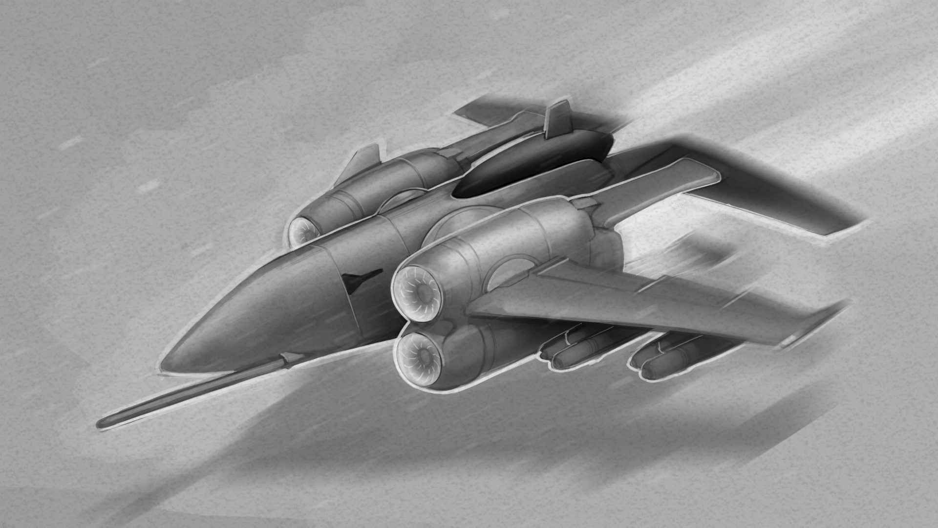
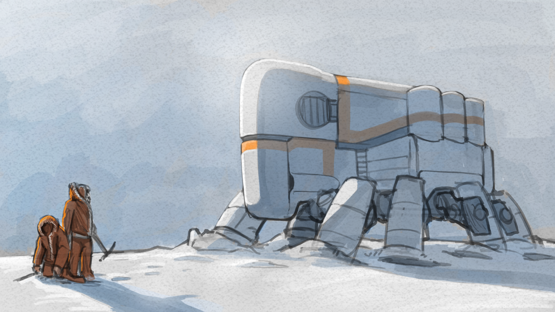
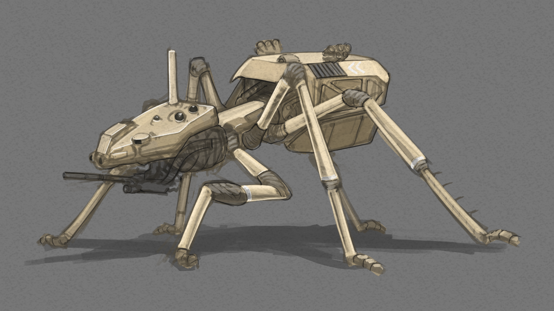
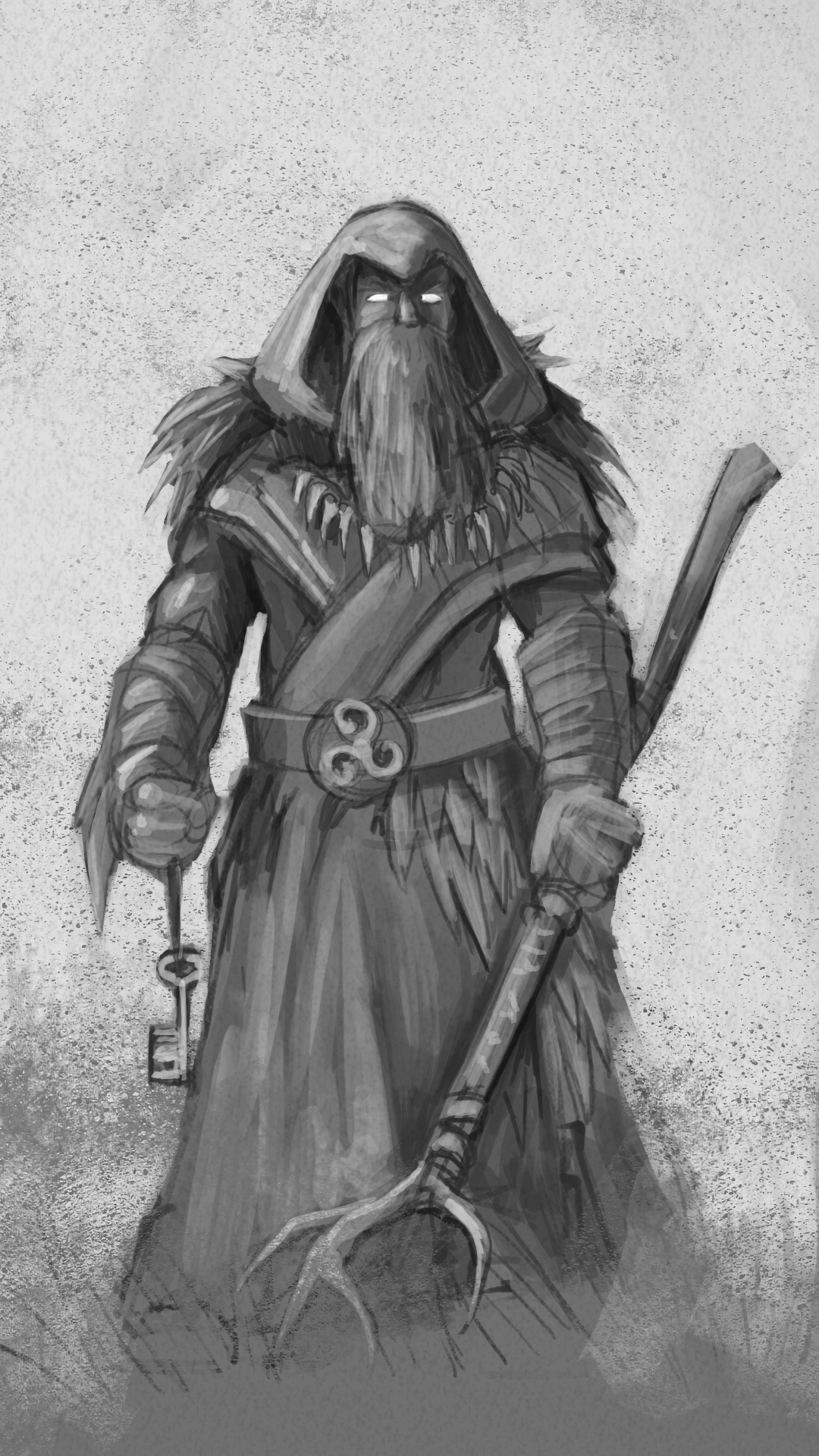
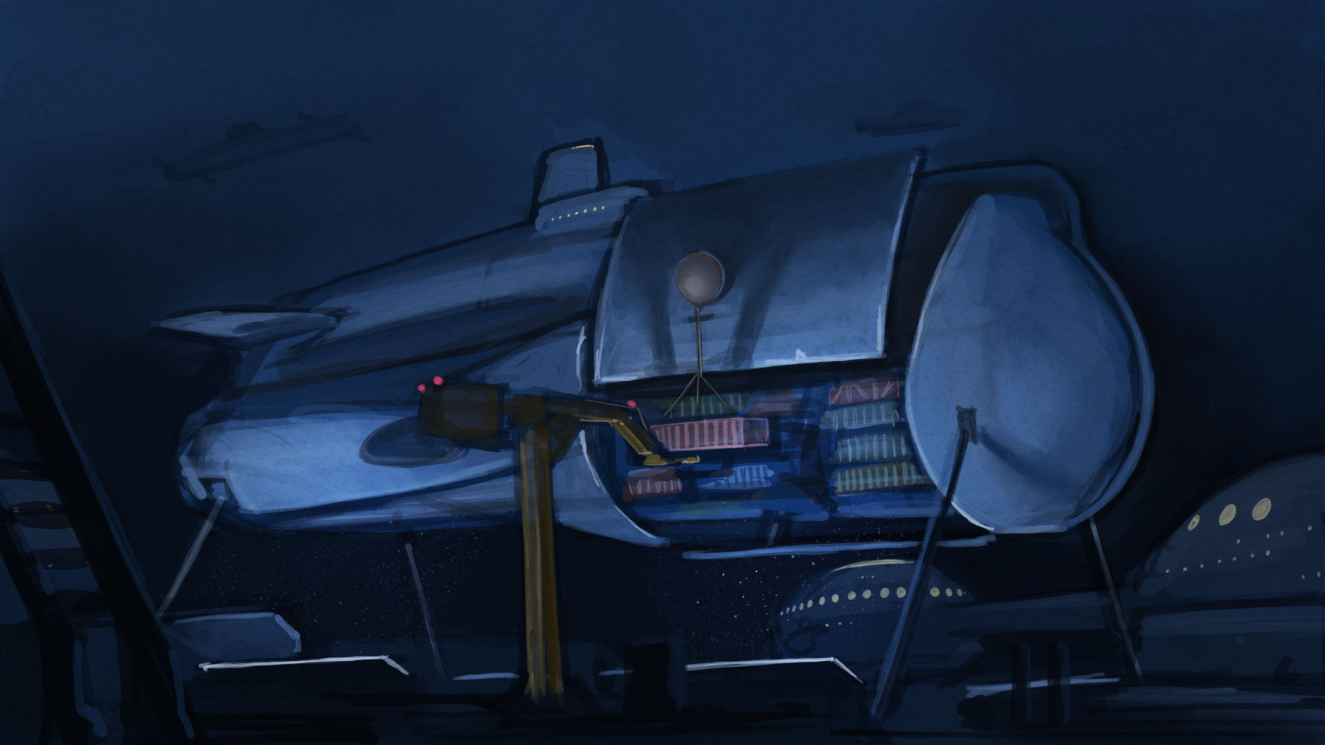
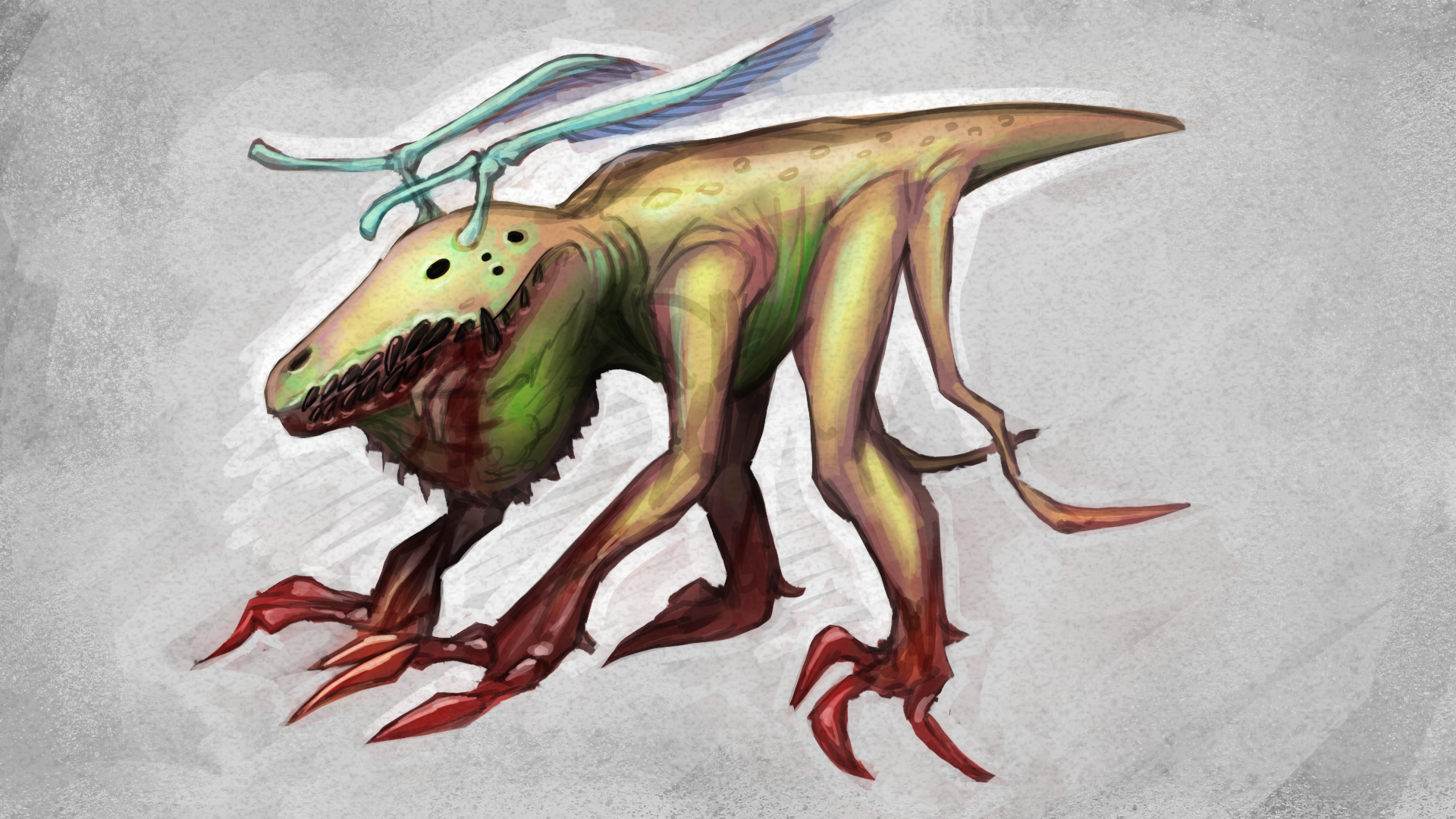
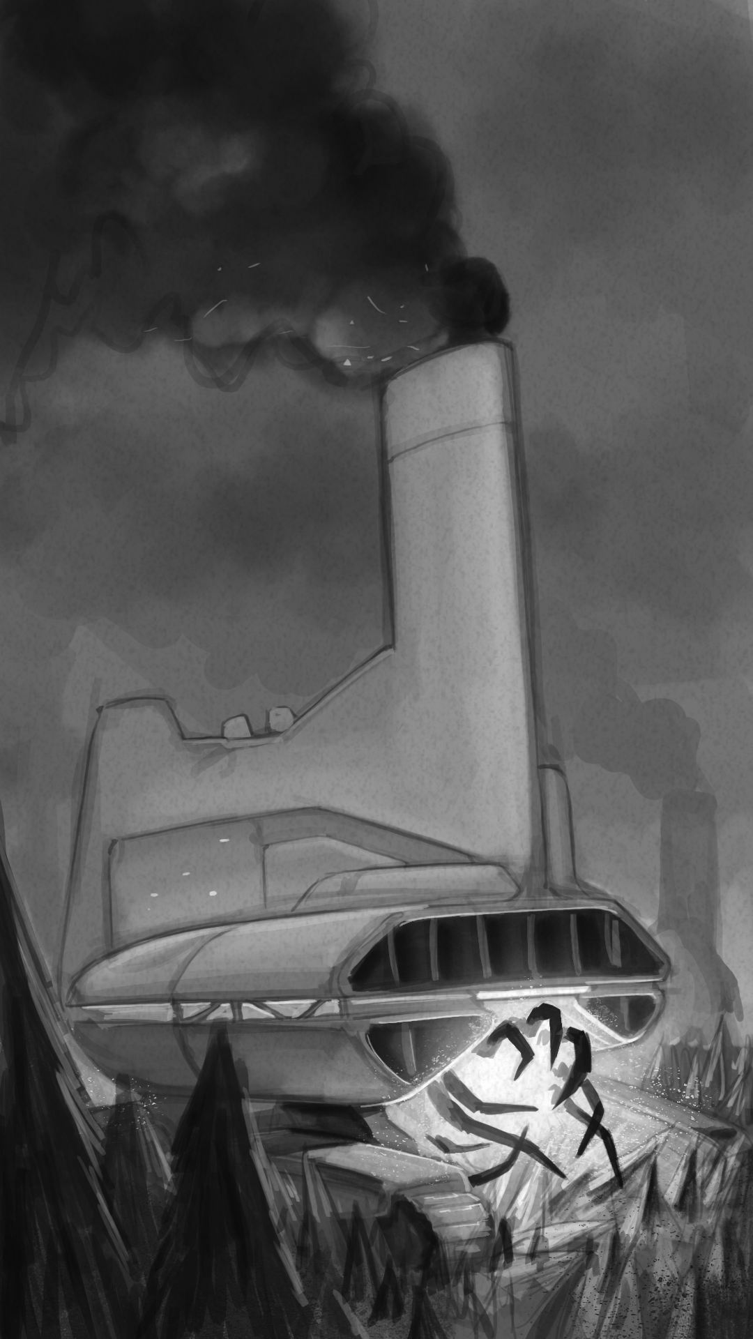
Here are the first few cards I did as a warmup to the project and style. At this point I didn't have an environment backdrop but the poses mostly matched the perspective... mostly...
A big goal here was finding the right blend between chibi and realism. The term "bot" should envoke a different feel from that of a "mech" for instance and to me and the client should be a bit more lighthearted in a way that might not be seen within other genera of robots.
The detail levels here are a bit higher than the rest of the bots before ultimately shifting down due to time constraints but the drift isn't too major I think. Another aspect that I needed to work around was the potential for late state color changes and/or team color changes. To do this I rendered the bots in full black and white and then masked in the primary and secondary colors for super easy future changes and management. This isn't a perfect solution but worked within my budget and carried over into the final promo illustration.
Anyway, here is the archetypical "tank" and "glass cannon" bots to start things off.
